To keep me busy over the summer, I responded to an email about doing some illustrations for a children's book. The client did not specify much about the sample work they wanted me to produce - only that the subject was a 4 year old boy whizzing through the air on the back of a stork, en route to a foreign land and that they wanted it to look a bit like the Mr Men illustrations (bold colours etc).
Straight away, I went and found any Mr Men material I could find by Roger Hargreaves. I tried to take note of the kinds of colours he used and the different line qualities.


Initial sketch:

I used a felt-tip fine liner, scanned it in and used the image trace function in Illustrator. I love the quality of line this produces but I don't love this attempt..
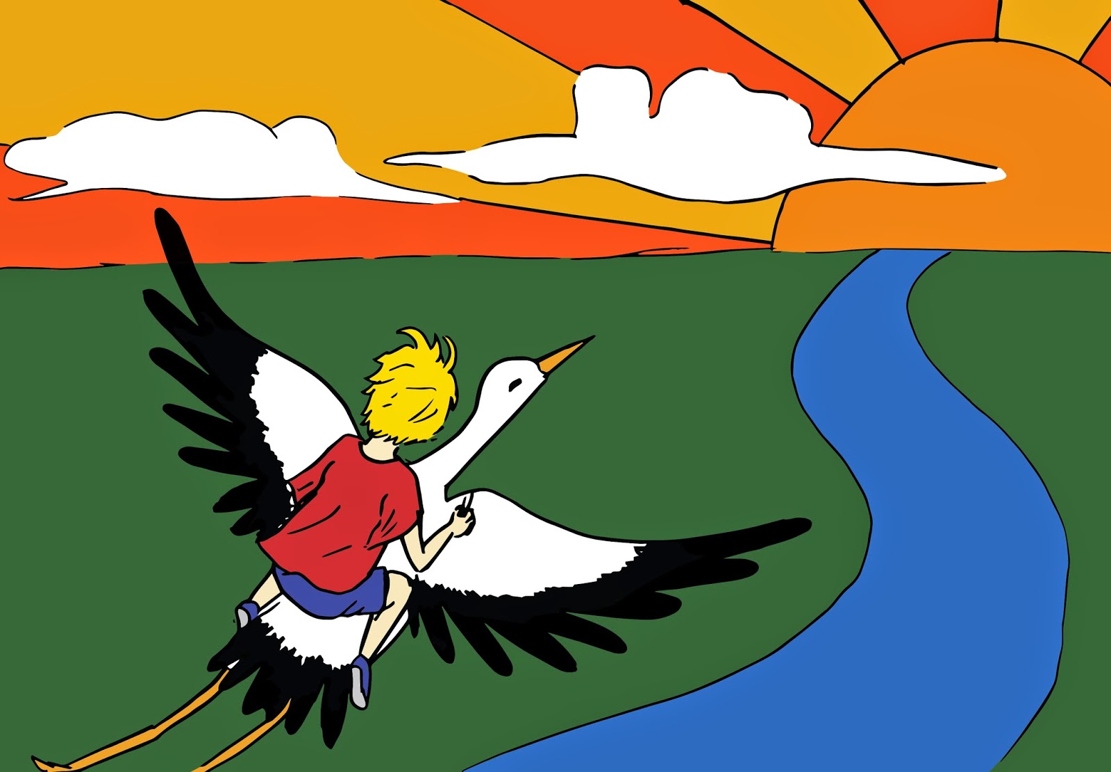
I re-drew the image again and tried cropping it because I didn't really like the A4 version. I am pleased with the line quality, however I do think that I could improve the composition (this would have been easier if I had been given a format to work to - the client could say something completely different to what I have produced thus far..).


I didn't put in lots of detail because this was just a sample and I wanted to focus on getting the correct aesthetic for the client. However, could this have been a mistake? Part of me feels as though I should have spent more time on this..
No comments:
Post a Comment