Wednesday 30 July 2014

AHS things

Whilst re-watching American Horror Story Coven, I noticed this scene and thought it would be interesting to draw something similar with my own interpretations of the characters.


I got really stuck with drawing the figure so I gradually started changing areas to look more exaggerated like Hayden Williams does with his fashion illustrations and to see how he actually draws the legs when the figure is walking/posing. Williams does this because it shows how the garments are supposed to hang and in the fashion industry long legs are more desirable. However I think it is good practice to play with the shape of body parts and see what still looks remotely realistic. 

Figure one of five:

Supreme Bitch Witch.


Wednesday 9 July 2014

Repeat pattern play


Falling in love with simple tattoo style artwork recently - had to get something similar out of my system.


Grrrl power

Have been thinking a lot about inequality recently. The only type of inequality I feel I can relate to is gender inequality and I know that I could be far worse off..
Using the felt tip fine liner pen again & using Illustrator image trace - I think I'm getting the hang of this process and I'm still loving the lines it helps me produce. 


Testing a new process..

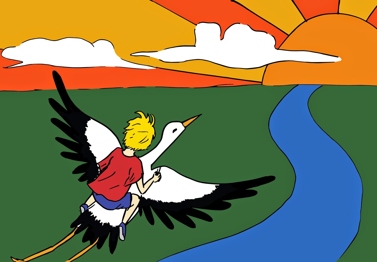
To keep me busy over the summer, I responded to an email about doing some illustrations for a children's book. The client did not specify much about the sample work they wanted me to produce - only that the subject was a 4 year old boy whizzing through the air on the back of a stork, en route to a foreign land and that they wanted it to look a bit like the Mr Men illustrations (bold colours etc). 
Straight away, I went and found any Mr Men material I could find by Roger Hargreaves. I tried to take note of the kinds of colours he used and the different line qualities. 


Initial sketch:
I used a felt-tip fine liner, scanned it in and used the image trace function in Illustrator. I love the quality of line this produces but I don't love this attempt..


 I re-drew the image again and tried cropping it because I didn't really like the A4 version. I am pleased with the line quality, however I do think that I could improve the composition (this would have been easier if I had been given a format to work to - the client could say something completely different to what I have produced thus far..).

I didn't put in lots of detail because this was just a sample and I wanted to focus on getting the correct aesthetic for the client. However, could this have been a mistake? Part of me feels as though I should have spent more time on this..


Trip to Slovakia


The purpose of this trip was to collect material for a charity/project's pilot which will eventually organise trips for groups such as Scouts & Guides. 
It was an interesting trip to say the least. We were on the border of Hungary and Slovakia and stayed in a place called Sahy (sha-he). The weather was great and I got to try out some interesting activities - such as making natural clay bricks, making rope and using a loom to make a rug. One of the best days of the trip was the last day - we got to spend the morning wandering around Budapest, where I would love to visit again in future.